Accordions are panels that animate open and shut to show relevant content inside. They are perfect for information that could otherwise be an overwhelming wall of text – course descriptions, or a list of policies, for example.
Don’t put any critical or very timely content inside an accordion – we can never guarantee that a user will open a panel. Panels can contain text and images – videos can work also, but sometimes the embed code can make the opening animation a bit jumpy. It’s probably best to leave videos either above or below the accordion.
The accordion content type has an option to enable special parsing. This would allow multiple panels to be created with one instance of the accordion content type. Specific text formatting would need to be followed for special parsing to work properly.
T4 Fields
Name
- Name of the accordion content type instance
Accordion Type
- Color of the panel(s)
- Options: Default, White Card, Light Beige Card
Title
- The title text of a single panel
- Use short, clear descriptions of similar character lengths to help with alignment across titles
Main Body
- Content of a single panel
Expanded
- You can choose whether an accordion appears expanded or not on page load
- A group of two or more panels will result in the appearance of collapse all items or expand all items option above the accordion
Group with other accordion
- You can group multiple accordion together by assigning them to the same group number
- Options: Group 01, Group 02, etc
Variations
Accordion Type Options
Choose a variation in the Accordion Type dropdown. The options are Default, White Card, and Light Beige Card.
Enable Special Parsing
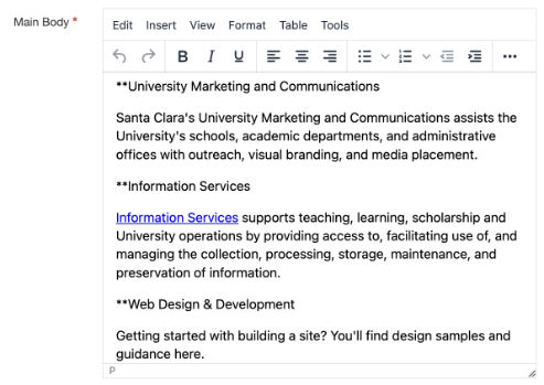
One accordion content type can be used to create multiple panels when special parsing is enabled. The Title field will be ignored. Proceed to create multiple panels using only the Main Body field. Each line that starts with "**" will represent the Title of the panel and the subsequent content before the next line with "**" will be the panel text. You can also group accordions with special parsing together by assigning them to the same group number.

Alert icon Please note the "**" must be unformatted.