May 24 - July 2, 2021
Virtual Exhibition
Today’s Zeitgeist imposes many social struggles upon us, and one solution to address them is by practicing vulnerability. This concept is broad, but a popular understanding says something about the extent of the need for help. The past year with the pandemic taught us that 2020 was intense for our mental health. Perhaps, for example, we needed to take strolls around the neighborhood rather than stay up late for homework as we would have done the year before. 2020, furthermore, continued to expose the immediacy of environmental damage––that the world is not herculean but deserves our love and respect. Although the Biden Administration has recently rejoined the Paris Climate Agreement, we still have a ways to go in order to address years of overconsumption.
These social problems are often in the back of our minds. This exhibition aims to place them at the forefront. We want to show why photographs––especially as a collection––can present new and dynamic, and suggestive and contradictory, ideas that strengthen and specify definitions of vulnerability. What can a combination of landscape photography teach us about mental health and the environment that we may not learn in everyday culture?
We think the photographs tell us that vulnerability is a process. It first involves degradation––an external force that gradually harms a subject. It then encounters healing––in which an agent tries to overcome the degradation. We also know that the process leaves behind scars––through which, one way or another, the degradation and healing are inescapable. If you are a college student, a faculty member, or the general viewer, we hope that you find this exhibition inspiring. Feel free to think about mental health or the environment––or perhaps brainstorm your own questions as you intellectually engage with this combination of photographs.

Ansel Adams, Aspens, New Mexico, 1958, 1958, gelatin silver print, de Saisset Museum permanent collection, Santa Clara University, Focus Gallery Collection, Helen Johnson Bequest.4.1989
Ansel Adams was a renowned landscape photographer. Most of his more famous works date from the early to mid-20th Century. Aspens, New Mexico, taken in 1958, is no exception to Adams’ aesthetic tradition. The grayscale style for landscapes was a common feature in his photographs. It emphasizes the compositions and tones that would otherwise be lost in color.
Aspens, New Mexico emerged serendipitously. According to Adams, it was while on a trip in Arizona to visit Canyon de Chelly that he stumbled upon the trees from the photograph. Adams wasn’t seeking out the trees, nor did he intend to visit the location. Instead, he pulled over to the scene simply because he noticed the stark contrast between the white leaves in the foreground and the darkness in the forest background. The trees were stately––they were indifferent to him and other human visitors.
We think this photograph conveys strength through vulnerability. Adams took the photograph in the fall, so the changing leaves seem to represent fragility. However, the fragile leaves are necessary to help the tree survive the winter. Therefore, the vulnerability is actually the tree’s source of strength. Furthermore, the contrast between the white tree and the darkness allows the viewer to feel that the trees could die at any moment. Yet the tree also stands strong and tall. The grayscale helps to convey this ambiguity by accentuating the contrast.

Mark Klett, Camp 3 at Lake Powell, 1984, gelatin silver print, de Saisset Museum permanent collection, Santa Clara University, Gift of David B. Devine, 1991.2.6
Taken at a camp in Glen Canyon’s Lake Powell, this photograph is a man-made disaster upon Colorado’s landscape. A man-made dam, for 17 years it caused the water from the Colorado River to build-up and thereby create Lake Powell. As a result, Lake Powell assumed an unnatural, grandiose presence within Glen Canyon that has now covered various landscapes in the park. Even though camp visitors may find the lake to be awesome, Klett has a different, more political and scientific interpretation. Themes of change and degradation, like Lake Powell, represent Mark Klett’s identity as a photographer. Klett’s undergraduate degree is in geology, but he earned his MFA in photography. Geology and photography create a partnership as the latter can preserve an image in the flux of time for scientific purposes.
Camp 3 at Lake Powell typifies a moment in time before the lake’s control over the land. With the calm, undisturbed water and smooth canyon rocks, the composition makes the photo feel quiet; the water and land, then, help balance each other. However, Klett makes sure to represent the canyons’ particular beauty by positioning the viewer at an eye level with the canyons. Furthermore, Camp 3 at Lake Powell shows us human interactions with the landscape. The scattered mattresses, the shopping cart, and the other items in the center suggest the effects of overconsumption or, conversely, the ebbing intimacy between the park and humanity before the water’s control. The banal, vague title of “camp 3” suggests this last interpretation; it seems that humans will soon be unable to experience a presence at the park, even though about two million families visit the park each year.

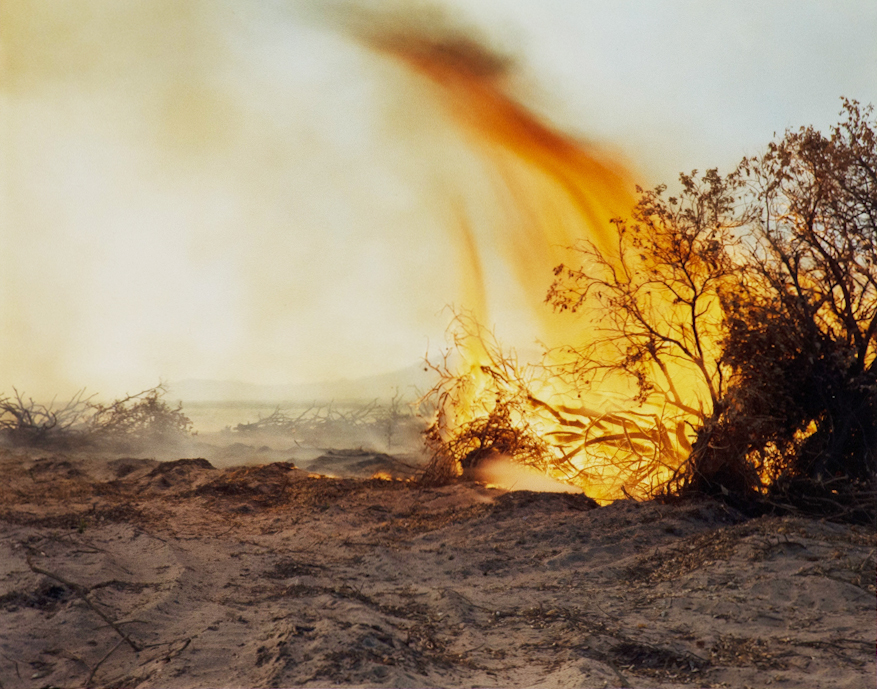
Richard Misrach, Desert Fire #77, 1984, chromogenic print, de Saisset Museum permanent collection, Santa Clara University, Gift of David B. Devine, 6.332.1986
Scholars know Richard Misrach for his photographs of the American desert. Misrach’s photographs are usually large, vivid in color, and intense in their action, which makes Misrach a pioneer and “established poet” in natural photography, according to Nancy Princenthal. Additionally, most of Misrach’s photographs engage with environmental history as he attempts to balance his depiction of beauty with humanity’s destruction of the environment.
Desert Fire #77 perfectly exemplifies Misrach’s style of landscape photography. Unlike the other photographs in our exhibition, the strong colors in this photograph create a mesmerizing image. You not only see the strength of the fire itself but also the movement of the flames that engulf the bush. Furthermore, the composition of the fire on the right in juxtaposition with the flames’ direction to the left emphasizes the spreading nature of the fire as it proceeds to the other bushes in the background.
While the photograph is visually awesome, Misrach’s narrative reveals degradation. The color was a means of captivating audiences to tell a story about environmental injustice at the hands of people and industries. Degradation is most clear in this photograph through the powerful fire itself. And the desert setting conveys the immediacy of degradation because it seems that any spark––small or accidental––could have caused the fire.

Unknown, Erosion destroyed hillside, 1/1/1938, 1938, black and white photograph, de Saisset Museum permanent collection, Santa Clara University, Purchased from Library of Congress, Washington, DC, USA, NDA.6.682
An original part of Santa Clara’s 1976 “New Deal Art” exhibition, this photo typifies California’s contribution to the New Deal era funding for the arts from the federal government during the Great Depression. According to Steve Gelber this funding was “intended for the people” as a way to galvanize a public response of sympathy and inspiration. Because photography in general reveals a ‘footprint’ of every subject, Erosion destroyed hillside, 1/1/1938 is not just aesthetic; it also depicts a documentary of farm life that faced the immediate disasters during the Great Depression.
The photograph blends the environment and the human world to show that erosion can happen to both––that the land and humans can impact each other simultaneously. In all-black are the trees, the ground, and the shack. The chair on the right is falling––but the photo captures it midway through the fall so it can match the chair’s tilt with the hillside’s curves. The photo feels sharp, moreover, because of the similar composition between the shack and the land, which includes the pointy tree branches, the steep cuts on the hill, and the dilapidated wood in the shack.
Yet, entering the space are the viewers who can transform how to make sense of this negative impact on the land. Due to the viewer’s positioning, we only see the shack as a tangential and cut-out feature of the photograph; the hill, on the other hand, becomes our central focus. We can then imagine what can lie on the other side of the hill. Because we are positioned beneath the hill, moreover, we can observe the sky above us; through juxtaposition, the sky reveals the many infinitesimal twigs on the tree branches. While we should be mindful of the disaster in front of us, we can also imagine positive effects that this clear sky presents on the subjects.

Dugan Aguilar, Stone Mother, Pyramid Lake, 1991, gelatin silver print, de Saisset Museum permanent collection, Santa Clara University, work selected by students in SCU Professor Kate Morris' winter 2007 class, ARTH 142: Native American Art: Special Topics. Funds for this purchase were made possible by SCU's Center for Multicultural Learning, 2007.3.5
Dugan Aguilar is a Native American photographer who spent most of his career capturing Native American cultures. In particular, Aguilar attempted to document the Paiute tradition, the tribe to which his father belonged. While culture was his unique subject, Aguilar drew stylistic inspiration from Ansel Adams in terms of composition and the subtle red filters over his photographs. Santa Clara University has displayed some of his works in a 2015-2016 collaborative exhibit with the San Jose Museum of Art that aimed to document the contemporary Native American experience. This exhibition taught us that the theme of preservation is relevant to our own Santa Clara community, especially given our exclusion and destruction of the Ohlone people through the land which we occupy.
Perhaps the most beautiful feature of this photograph is not the style itself but the narrative behind it. In Paiute culture, the Stone Mother represents the partner of the Father of All Native Americans. The father inhabited the land, but upon feeling lonely, he met Stone Mother as his partner. Together they had children and created the many rivers and lands that surround the Pyramid Lake area. However, after the father died and the children left their home, the Stone Mother was alone. So, she moved to a ledge at the top of a mountain that overlooked the valley and proceeded to cry, creating the lake through her tears. She has never left her ledge.
In the photograph, Aguilar captures the Stone Mother through the stone structure in the middle top of the image. The Stone Mother used to be accessible to visitors, but vandalism and mistreatment of the structure forced the area to be closed to the public, only allowing members of the Paiute tribe to access the location. From the perspective of the narrative, the lake is a result of the Stone Mother’s efforts to recognize her emotions. Thus, we think there is a sense of strength and perseverance that can emerge through an experience of pain. Aguilar seems to agree, as the Stone Mother remains through the subject of the photograph.

Arthur Rothstein, Taos Land Use Project, New Mexico, 1936, gelatin silver print, de Saisset Museum permanent collection, Santa Clara University, Purchased from Library of Congress, Washington, DC, USA, NDA.6.726
Arthur Rothstein was an American photographer whose work played an integral role in the United States’ cultural recovery from the Great Depression. In 1936 he became the very first photographer to work with the United States Resettlement Administration. The RA was an agency developed under the New Deal that aimed to relocate groups of underprivileged Americans. The RA was in effect from 1935 to 1936, but despite its short history, it served as the genesis for Rothstein’s photographic process.
This image, taken by Rothstein in 1936, captures a desolate stretch of land in Taos, New Mexico with an imposing collection of mountain peaks in the distance. Intending to help inform the public about the work of the RA, this image had a small block of notes that read, “Barren overgrazed land on the Taos land-use project, New Mexico. This land will become good sheep-grazing acreage when the grass is allowed to grow back.”
In addition to their relevance for today’s era due to Taos’ lingering effects on the environment, these notes amplify the degradation during the Great Depression. Crucially, Rothstein captured this photograph near the Dust Bowl. In the country of Colfax, New Mexico to the East, severe wind eroded the land during the Dust Bowl and for the following two years. This is most noticeably put on display through an eerily empty plain.

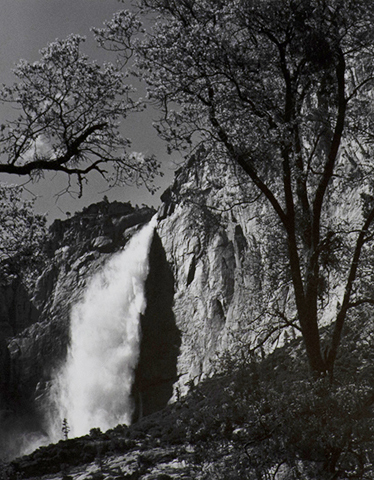
Ansel Adams, Yosemite Falls, Spring, Yosemite National Park, California, 1983, gelatin silver print, de Saisset Museum permanent collection, Santa Clara University, 6.337.1986
Since its founding in 1890, Yosemite National Park has attracted travelers from around the world. Yosemite Falls, a thundering 2,425-foot-tall behemoth, has long been a major attraction for visitors wishing to experience the park in all its splendor.
This image, taken in 1983 by the famed environmental photographer Ansel Adams, captures the crest of the waterfall with its stream sending a haze of water in all directions. Adams, who spent his life championing the preservation of the United States’ most treasured natural spaces, photographed Yosemite Valley during his career with the Sierra Club. Reflecting on the beauty of Yosemite, Adams once stated the following: “I know of no sculpture, painting, or music that exceeds the compelling spiritual command of the soaring shape of granite cliff and dome, of patina of light on rock and forest, and of the thunder and whispering of the falling, flowing waters.”
On the scale of either a simple waterfall or that of the whole Yosemite Valley, each natural feature is an unexpected work of beauty. Be it the “granite cliff and domes,” the movement of the glaciers, or the “falling, flowing waters,” the beauty of Yosemite stands at a history of destruction. An incremental process of erosion wears the sand and stone, inscribing the landscape with an array of magnificent, lifegiving scars.
Envisioned Installation Layout

The mezzanine invites our audiences to the exhibition due to its location within the de Saisset Museum. When patrons first enter the museum, the mezzanine is the first gallery in their immediate view. Oftentimes the de Saisset museum places the installation title on the wall just underneath the mezzanine (see Figure A below), which draws the attention upward and thereby encourages guests to visit it. Furthermore, viewers can immediately see the back wall (see Block 2 and 3 above) as they stand at the foyer’s ground level. As Noah can attest, this makes it easy for visitor-service associates to point to the pieces on the mezzanine as many patrons prioritize that space during their visit.
We believe the Mezzanine is the ideal location in the museum in accomplishing our goal of reshaping vulnerability. On their path up the stairs, viewers will first be met with the ‘healing’ aspect of vulnerability through Erosion and Stone Mother (Block 1). Even though we framed these two photographs as a response to degradation, we wanted to show them as the first piece of our exhibition. For, first of all, the stairs create a metaphorical rising that complements the photographs’ theme. Secondly, the viewers cannot fully understand the theme of healing until after they’ve continued learning from the rest of the installation; crucially, this stairwell is the only point of exit and entry for the mezzanine.
Then, in Blocks 2 and 3, viewers will come across a gallery statement that explains the message behind the installation. We do not want to show this statement before the exhibition because we hope the viewers can also engage with the images conceptually on their terms. Next to the gallery statement will be the selection of ‘degradation.’ In Block 4, the wall closest to the men’s restroom, two images illustrate the lasting effects, or ‘scars’. From Block 4 back to Block 1, there is a transformation of perception as viewers leave the building and recognize the healing process in Block 1.

Figure A - Foyer of the de Saisset Museum, featuring the Mezzanine


